User Manual for Checkly
Updated: 06.05.2019 16:26Signing Up
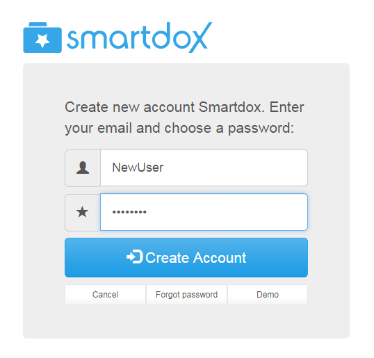
Welcome to Checkly! Before you can start editing and sharing checklists, you must create a user account. Signing up for Checkly is easy and quick! Simply follow the instructions below, and you'll be ready to go in no time. You can also sign-up using a Facebook or Google+ account by selecting one from the "New Account" menu.
Head over to www.checkly.net
Click "Sign up"
Enter your e-mail and choose a password
Click "Create account"
Open welcome email we sent you
Click "Verify" link to activate your account
Creating a new User:
Requirements:
Platform |
Minimum Requirements |
|---|---|
Desktop |
Microsoft Edge, Google Chrome, Mozilla Firefox or Safari (latest versions) |
Google Android |
Android 4.4.4 (KitKat) |
Apple iOS |
iOS 10 or higher |
Creating Checklists
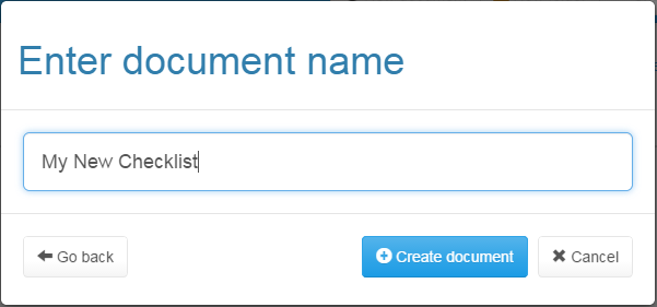
Click on the "New Checklist" button, choose a name for your new checklist. A blank checklist will be created.
The Checklist opens in Design Mode, where elements can be added or removed. You can toggle between Design mode and Checklist Entry mode by clicking on the "pencil" icon shown in the upper-right corner (icon displays as a lock when not in Design-Mode).
Only the content/state of elements can be accessed while in Checklist Entry mode. You must re-enter Design Mode if you wish to reformat the Checklist.
Creating a New Checklist:
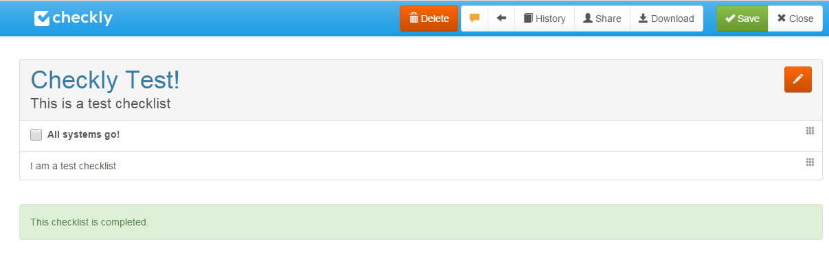
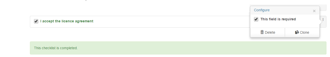
The Checklist Status Bar at the bottom of the checklist will update in real-time to indicate when all elements set as "required" have been filled out. The status bar will validate the checklist in both Design-mode and Input-mode, and will turn green to indicate a fully completed checklist.
Checklist Elements

The image above shows the 8 input-elements of the checklist, and the 4 content-formatting features. Each element has a context-menu icon, displayed as three vertical dots on the right of the element, as shown below:
The Context-Menu:

The "Clear" button will return all elements of the checklist to their default values.

If you click on the context-menu icon, you will see a popover displaying a list of options specific to each element. You can also rearrange elements in your checklist by clicking the context-menu icon and dragging the element to the desired position.
The context-menu popover:
Input Element |
Description |
|---|---|
Task |
Series of buttons for recording test results. The default buttons are: "OK FAIL PASS". You can also add you own custom buttons. |
Check |
Checkbox that can be set as "required". You can set it to be checked or unchecked by default on your template. |
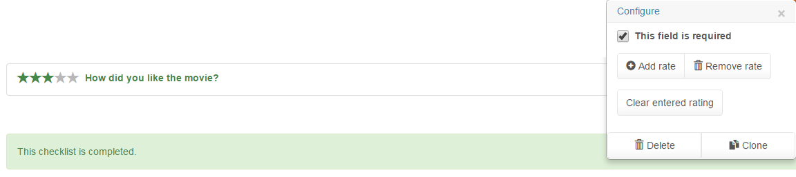
Rating |
Rating in the form of 5 stars. Stars can be added or removed. This field is set to required-input by default. |
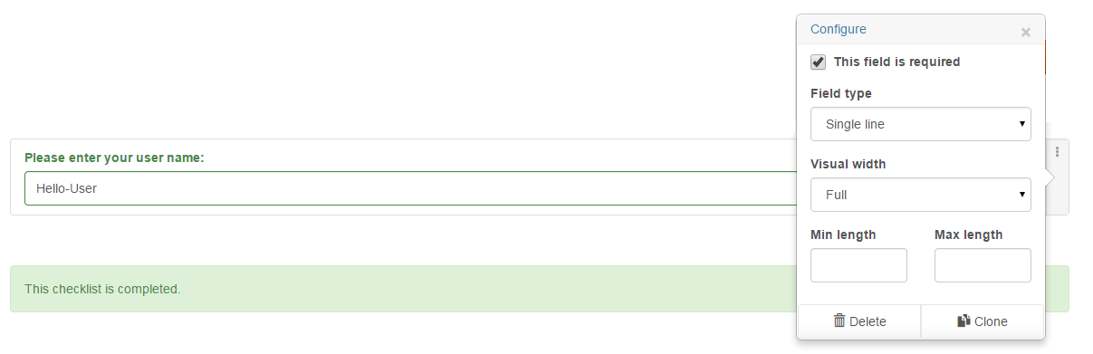
Input |
Input field that can be set as single- or multi-line, for phone numbers, email addresses, and more. |
GPS |
Button that the user can press to record their GPS coordinates. Will notify the user if there is no GPS antenna available. |
Camera |
User can snap a photo with their device's camera. If no camera is found, opens a window to choose an image file. |
Sign |
Field for writing a signature (with stylus or finger) on mobile devices. If the user has no touchscreen, the mouse is used to sign the form. |
File |
Allows a file to be appended to the checklist. Opens a "browse folders" dialog when clicked on by the user. |
Content Element |
Description |
|---|---|
Chapter |
The "Chapter" field creates an expandable sub-section. Chapter subsections can contain any type of element. The "+" icon is used to expand/collapse the chapter. |
Text Paragraph |
Line or paragraph of text. This is read-only when filling out the form. Different colors and fonts are available in the context-menu. |
Image |
A single image that is uploaded to the server when the template is saved. The image can be re-sized in the context-menu. |
Image Row |
Row of images (minimum 1 image). Behaves like "Image", except the images are displayed as thumbnails to users. |
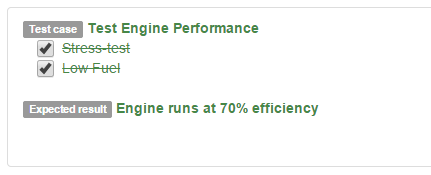
Task Field
When designing a Checklist, the Task field is used to record the result of a task that will be performed. The default result buttons are OK FAIL PASS. More buttons can be added or removed as necessary. The displayed on the Task buttons can be modified. For example, a test can succeed OK with 100% efficiency, or PASS with 50-90% efficiency. If you select "Enable Fail Documentation", you can enter details about why the task failed, and also add images or screenshots.
Task Field and Config Menu:
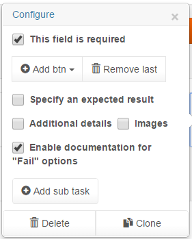
Select "Specify an Expected Result" to enter a custom test-case description and the expected result. The "Add sub task" button will insert a checkbox under the "Task Label" field, where you can specify extra details or prerequisites for your test. Once all of the sub-tasks have been tested, the Task field will display green text, and the sub-tasks will be crossed-out.
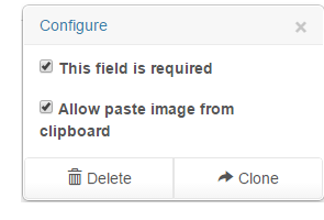
Checkbox Field
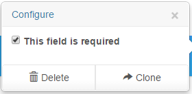
The Checkbox field can be set as "required" in the context menu. By default, it is not set as required.
Rating Field
A Field for entering ratings, by default it is a Required-Field with a rating out of 5 stars. You can add and remove stars as necessary by clicking "Add/Remove rate" and clicking on "Clear entered rating" in the context-menu will erase the entered rating.
Input Field
Example Input Fields
Input Field Type |
Input Field Description |
|---|---|
Single Line |
Field for entering a single line of text input. |
Multi Line |
Field for entering multiple lines of text. Pressing ENTER will expand the field one line. Field also expands if characters inputted reach the edge of the field. Multi-line fields also shrink when a line of input is deleted. |
Email address field that is validated to confirm address is in proper format. |
|
Number |
Number field that will accept only numeric characters. |
Phone Number |
Field for entering phone numbers. Different from 'Number' since it accepts symbols like the '-' separator. |
Date |
Date field with a drop-down calendar button. Displays a date for input, in the format used by the user's browser. |
Time |
Time-entry field that displays a time-selector based on the user's browser-configuration (if user is using 24H time, it will be displayed here). |
Month |
Field for selecting a month and a year. If supported, the user's browser will have a drop-down calendar selector. |
URL |
URL entry field that validates to confirm that input is in the form of a URL. Does not confirm whether or not URL is connectable. |
Range |
Range field that displays as a slider control if supported by the user's browser. |
The Input Field context-menu has extra options for some field types. See the table below:
Optional Item |
Description of Option |
Applies to These Fields: |
|---|---|---|
Required Field |
Check this box to specify that some user input must be entered into the field. If a required Input-Field is empty, an error message is displayed to the user. |
ALL Fields |
Visual Width |
Horizontal space that is occupied by the field. Set to a percentage of browser window width, or a fixed number of characters. |
ALL Fields. |
Min Value, Max Value |
Minimum and maximum numerical values that are accepted by the Input Field. Can be integers or floating-point. |
Number, Range |
Step Value |
Incremental value to use, when the user clicks on the up/down arrows for numerical Input Fields. |
Number, Range |
Min Length, Max Length |
Minimum and Maximum length (in characters) for alphabetical Input Fields. User will not be permitted to type more than the Max Length. |
Single-Line, Multi-Line, Email, Phone Number, URL |
Delete |
Design Mode option that will delete the Input Field from the Template. Can be undone with Undo option at top of screen. |
ALL Fields |
Clone |
Allows you to copy an Input Field, along with all the settings in the Configure Popover for that field. |
ALL Fields |
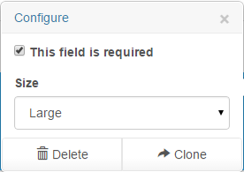
GPS Field
The GPS Icon and Configure Popover
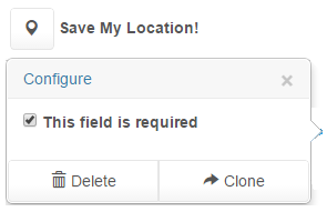
The GPS Field is a button for recording the user's GPS Coordinates. It is a Required Field by default. When clicked on, it will ask the user permission to record their location. The location can then be viewed on a map by downloading the Status Report from the "Download" menu.
Camera Field
Camera-Button Popover, and the Camera Icon
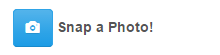
The Camera Button is used to record a photo with the camera, if it is available on the system. If there is no camera available, the user will get a "browse folders" window and they can select an image from there. The option to paste an image from the clipboard is also available to the user.
Signature Field
The signature button will display a white field where the user can sign the document with their stylus or finger

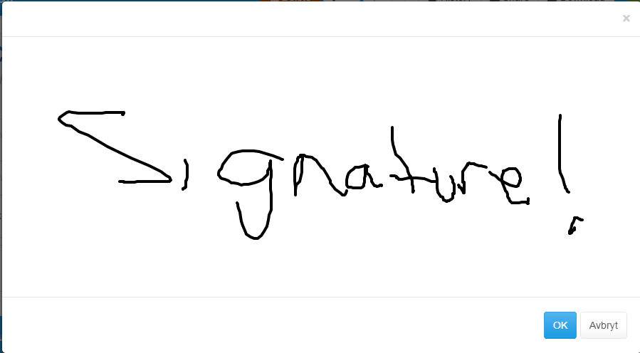
If there is no touchscreen available, the mouse can be used to sign a document.
The signature field can also be used to draw a quick sketch or diagram.
In the Popover menu, the width of the field can be specified.
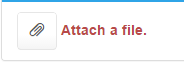
File Field
The "File" button opens a dialog for the user to select a file to attach to the checklist.

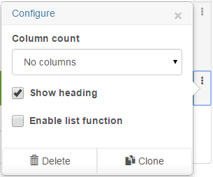
Chapter Element
The "Chapter" Element is used to format documents to collapse and expand when the user clicks on the "plus" icon


Option |
Description |
|---|---|
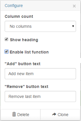
Column Count |
Chapters are divided horizontally into a maximum of 5 columns. If "No columns" is selected, items inside the chapter are displayed vertically. |
Show Heading |
Displays a name for the chapter. If unchecked, the chapter displays fully expanded. |
Enable List Function |
|
"Add" Button Text |
If "Enable List Function" is checked, you can customize the text on the "add" button for the list. |
"Remove" Button |
If "Enable List Function" is checked, you can customize the text on the "delete" button for the list. |
Text Paragraph Element
The "Text Paragraph" element adds text content to the document. In the popover menu, various styles of text can be selected.
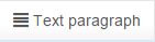
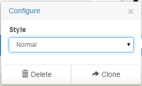
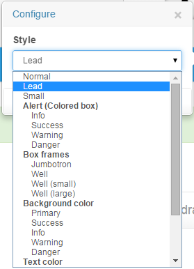
Image Element
The "Image" element is used to attach images to the document.

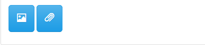
The "image" button opens a "browse folders" window for the user to select a saved image.
The "paperclip" button pastes an image from the clipboard.
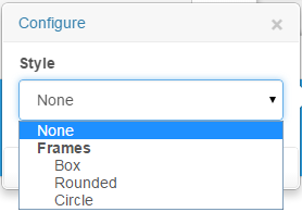
Popover menu allows different types of frame style for the image.
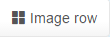
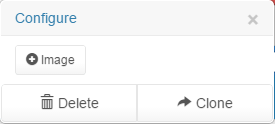
Image Row Element
The "Image Row" element behaves as a horizontal list of "image" elements. Images can be added and removed as needed.
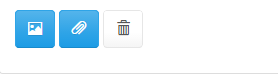
The "image" button opens a "browse folders" window for the user to select a saved image.
The "paperclip" button pastes an image from the clipboard.
The "trashcan" button will delete the selected image from the image row
Popover menu allows you to add more images to the image row.
Exploring Folders
Tags containing any extra relevant information are displayed next to checklists.
Blue "Shared" tag - an item that you have shared with others.
Blue tag with a username - an item shared with you by that user.
Green tag with a username - name of the user who last modified that item.
Green "Updated" tag - an item that has been modified recently.
Green "New" tag - an item that has been created recently.
Orange "Deleted" tag - any items that have been deleted (appears when viewing the "Last Deleted" list).
You can also sort items for viewing, by selecting "List" in the Folder View. See the table below for details:
My Favorites |
Lists all items that you have marked as "Favorite". Toggle a favorite by clicking the Star icon to the right of an item. |
Shared Items |
List of items that others have shared with you. If someone has shared a folder with you, all items within that folder will be displayed. |
Team Feed |
List of items that have been recently modified by other users. |
Last Modified |
List of items by date last modified, with most recently modified displayed first. |
Last Created |
List of items by the date created, displays most recently created first. |
Last Published |
List of items by the date they were published. This displays the most recent publications first. |
Last Deleted |
List that allows you to un-delete items. The most recently deleted items are displayed first, and you can un-delete an item by clicking on it. |
The "Search" element at the upper-right of the Folder View has two functions:
Filter the items displayed in the current folder by typing a partial search phrase.
Search all folders by pressing ENTER.
Folder View - Button Bar Functions
The Button Bar is shown at the top of the screen in Folder View:

"New Checklist" will prompt for a checklist title and enter Checklist-Design mode. If not in Home Folder, make sure you have Write-Access to current folder.
"New Folder" will prompt for a folder name. If creating a folder outside the Home Folder, you need Write- or Admin-Access to the current folder.
"Share" will open the Sharing Dialog. For more info see the chapter: "Sharing Folders and Checklists".
"Refresh" queries the server to renew the display of Feeds such as "Team Feed" and "Deleted Items"
"Send Feedback" allows you to submit a comment or question to the Checkly Team
"About Checkly" will display some brief information about the Checkly app.
"Log out" will log this browser out of Checkly. If you are logged in through another browser, that session will stay logged in.
Settings Menu
Login Settings, Profile Settings, and Account Deletion
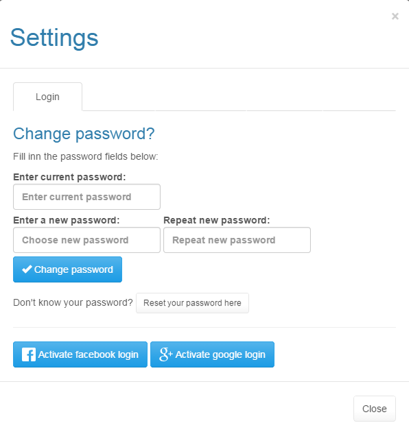
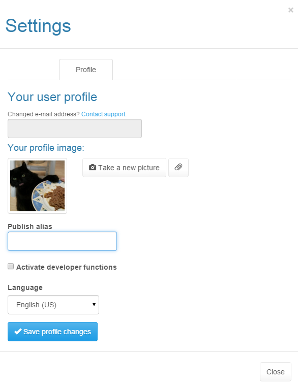
You can change your password on the Login Settings page. You can also choose to link Checkly with your Facebook or Google+ account. Checkly will not post anything on your profile(s). Only one social-media login option can be used at a time.
On the "Profile" Settings page, you can view the email address associated with your Checkly account. You can also choose an image to use as your profile picture. The image will display when other users view checklists or folders you have shared with them.
Your "publish alias" will be appended to any checklists you publish to the server, in the form of checkly.net/alias/checklist-name
You can also select the language for the Checkly user interface. Currently, Norwegian (Bokmål) and US English are supported.
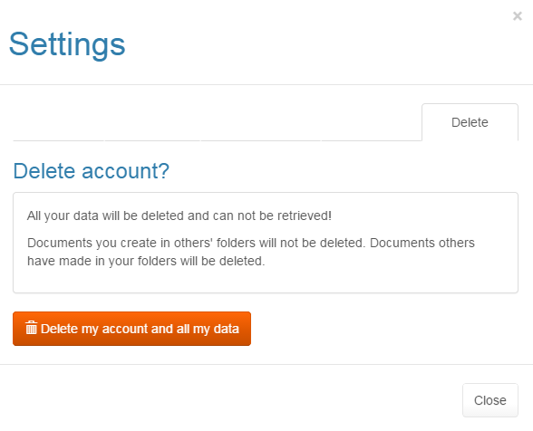
You can also delete your entire account from the "Delete" tab. All data created by your account will be lost, except any data you've created in others' folders!
Sharing Folders and Checklists
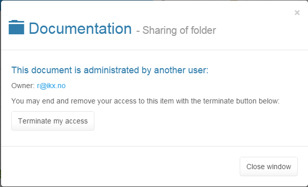
When editing a checklist, you can share it by clicking "Share" on the top ButtonBar. You can also cancel your access to a folder that has been shared with you by clicking "Terminate my Access"

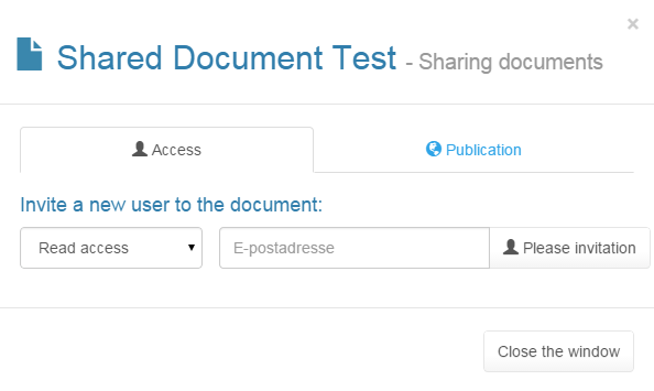
Read-only: This permission gives read-only access to the user. The user can open and view the document, but they cannot modify it.
Write: This permission allows the user to open and view the document. Additionally, the user may make modifications and then save them.
Admin: This is a "super user" permission. A user with admin access can publish, delete, share and move the document to another user's folder. The owner of the document can possibly lose access, so this permission should only be given to highly trusted users.
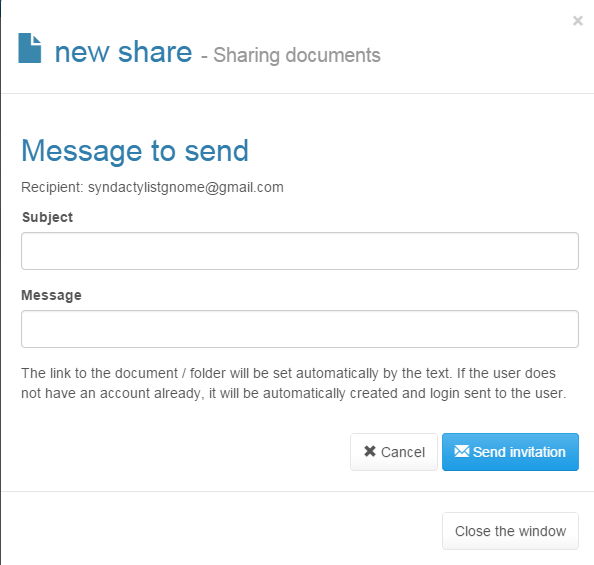
When you invite a new user to share a document, you will be presented with a dialog box that allows you to notify that user by email of the new share. Checkly will send an email to the user, with the subject and message that you specify here.
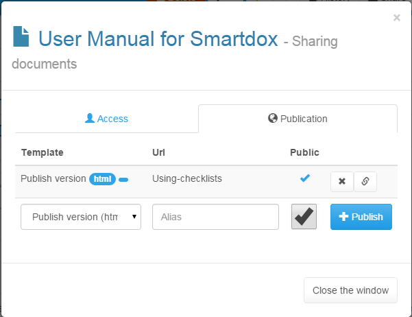
Publishing Checklists
The "Publish" option is available from the "Share" menu.